Sleek Business Website
When my good friend Justin Benline picks up the phone and tells me his company is looking for a new website – the first thing you do – make a snide comment about him and laugh. It is what old high school buddies do, right? Actually, you pick up the phone and talk to the guy running the show.
Stark Glass in Massillon, Ohio was looking for a refresh to their business website. Their old website wasn’t awful, but it wasn’t turning any heads. When part of your business relies on showcasing your attention to detail and expertise, you need to showcase some proof….and boy did they have proof!
Business with Friends
I was a bit hesitant at first to take a meeting with one of my best friends employer. The last client I took on with a friends recommendation was a bit troublesome. As much as you lay our ground rules and expectations, not always do things run 100% smoothly. I learned that just because a friend recommends you, you still have to interview the client to see if YOU want to work with them.
I drove up one morning to Stark Glass with Justin. He was telling me about his company for several years and how well they treated him. He said they needed a new business website and invited me up to their office in Massillon. I met with the owner, his wife, and the new marketing director.
It didn’t take very long for me to realize these were good people. They built their company up to a very successful enterprise. They had a brand new building and wanted a website that showcased their true brand. The current website was accurate – just not pretty or compelling. This was a client I could work with.
Trying New Things
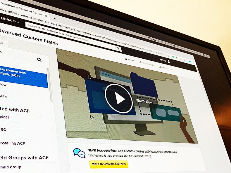
Over the last few months, before I started this project, I was doing some additional training on WordPress. I like to freshen up with the essential courses but also like to review new trends and features. I found a series of courses talking about Genesis – a framework used for child themes in WordPress.
Child Theme
A child theme is important for WordPress websites for customization. When you purchase and install a theme, you add your content and it looks very similar to the demo. Sometimes you can change colors and fonts and other times you are stuck with the defaults. More importantly, you are stuck with the features embedded in the theme. Sometimes you can add functionality with plugins, but sometimes you need to make adjustments to the theme.
If you make an adjustment to the theme, whenever there is a patch – you update and lose your custom code. This has happened to me in the past and it was not a fun experience. A child theme is a clone of the main theme but allows you to make customizations that will not be erased with theme updates.
Genesis
The wonderful thing about discovering Genesis is the flexibility of child themes. Genesis was developed by StudioPress and is an actual theme. Developers use the Genesis theme as a framework and develop child themes based on the master Genesis theme. You install Genesis and buy a child theme and customize like crazy. When a new WordPress version comes up, you update Genesis and your child theme is safe.

When I discovered the Lynda courses on Genesis, I purchased the theme and purchase a child theme to trial. I found that Genesis had a great community of developers giving information on forums about common issues, tips, and techniques. Learning Genesis and having the help to customize as a great tool to add to my toolbox.
Advanced Custom Fields (ACF)
As I watched video after video on Genesis, I stumbled on some courses about Advanced Custom Fields. This was a plug-in used for WordPress that allowed for more customization and better organization of the backend content. At the time, WordPress was pretty basic on the backend. You could add a title, the body content, and several other added features. If you weren’t using a drag and drop editor, you had to mix HTML in the body to get the certain desired functionality.
One issue I typically found with client websites were the inconsistency of styles. Not only were we copying and pasting code to each page (often the exact same thing), we were mixing fonts and colors. This always drove me crazy – knowing there is a world of CSS and Databases. ACF fixed this for me for so many clients.

In a nutshell, ACF allows the developer to put additional fields on the backend for the users. Instead of just the body text, you can add a section for related pages, images, or content. You can then style these sections in CSS. The backend user can be instructed what the new field is for and be restricted to only inserting what is needed. The styling will all be done by code and everything is consistent.
This was a game-changer for many of my proceeding projects.
The Content and Search
I knew I was going to use a Genesis theme and use WordPress. The client wanted the ability to make changes and this was our best route. After the discussion, we had an objective to hit two demographics.
- Commercial
- Residential
Both demographics were going to discover and use the website in different ways. The commercial customers would be doing some research and looking over previous work. The residential customers needed to discover the business website through search. The goal of the site was to showcase Stark’s portfolio and optimize the site for residential keywords.
Building Out Pages
We could go the traditional route and make one service page and list everything with a small blurb. This is always the easiest path, but not the most successful. If you want to show up on search engines, you need to develop a page for every major keyword you want to index for. That’s what we did.

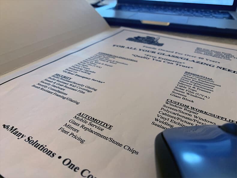
I was handed one piece of paper that had a list of services. I had zero knowledge of their industry. Luckily I had a friend I could call and ask “what does this even mean?” – but luckily Google and online blogs helped me fill in the gaps.
I went through the services, the old site, and various industry websites and came up with a good site outline. It was important to them that we also highlighted the team. At the end of the day, we had thirty-plus pages to develop.
Research and Writing
I remember waking up early on a Saturday and gearing my brain for a day full of research and writing. I went through each service and searched online and read various articles about each topic and pulled out some of the key points. The goal was to write several paragraphs for each service.
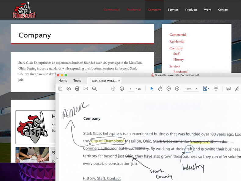
I knew that I couldn’t just publish the content without review, I wrote everything in a Word document. This would make it easy for corrections by the client. After a very long day (might have been several), I finished writing content for every service. I sent over the draft to the client and moved on to the next section: waiting for feedback.
Finding a Theme and Designing the Site
I knew I wanted to dig deeper into Genesis. StudioPress had a lot of Genesis themes and went through all 40 looking for a perfect theme. One caught my eye.
Normally I stay away from themes with images as the background. I like a nice light-colored background – but this business website could be different. Stark Glass supplies glass for some very beautiful structures. I’ve looked at some of their pictures. I knew that we could grab the users attention from the start with these images
The theme was made for a creative agency. It would take some development work to get it to fit a glazing company, but it was possible. With the help of plugins and some customization, I would make it their own.
Color, Imagery, and Styles
Stark Glass had a very nice logo created several months earlier. The logo was a knight (grey and red). The original theme was yellow and didn’t offer the easy customization to make it fit. With a little CSS help, I made that change quickly.
There also wasn’t a lot of breathing room on the original theme. The heading crowded the content. The font selection was fine (there was no defined style guide for Stark Glass), but we needed to play with size and spacing.
The original theme called for one background image. I wanted it to rotate randomly from page to page. This would work as a subtle slideshow that the user didn’t know they were partaking in. I found a few resources and a few lines of code made this a reality.
Development and DRY
The content was approved with some edits and was ready to go. The design was laid out and looked good. It was time to get the business website fully functional.

Related Pages
One thing I learned from ACF training was the ability to call in other pages on the site. I created some widget areas that allowed the user to select pages on the backend and automatically pull the excerpt, featured image, and link. In the situation we needed to make a change to the page, this would automatically update everywhere and not require the user to go in and update the excerpt on every page.
You never want to repeat yourself when coding. DRY – don’t repeat yourself. This is a common practice to avoid writing the same line of code in different locations. The goal is to write it once and call in the data when needed. This can also be said for content. Granted, you don’t want to have too much duplicate content on your site – but there is no need to copy and paste links on every page.
Portfolio Gallery
One last item that needed to be addressed was one of the most important: the portfolio of work. We needed to have an easy way for an in house employee to add new images to the site.
We could create a new page or post for each new project but that could get dangerous. The styles of the images and functionality would not be ideal. I could use ACF and pull in images – but that seemed trivial. All we needed was a good photo gallery plugin.
After sampling several in one of my sandbox websites, I decided to use NextGen Gallery. This was an easy plugin that allows you to upload photos and display several types of slideshows or galleries. You could tag your images and pull in specific photos. You could use shortcodes and insert specific galleries to any page.
The plugin ratings checked out, the plugin was kept up to date by the developers, and it was easy to use. We had our solution.
Final Thoughts – Business Website Success
Helping out a friend and his company turned out just fine. We all knew our roles in the process and had clear expectations. We hit our deadlines and we upgraded the site to a much better, information-rich business website. The commercial business owners (doing research) could see previous Stark work. Residential customers could search and get dedicated landing pages for Stark services.


