Money-Saving Multi-Location Website
When you work with people all over the Ohio Valley, sometimes you get referrals from all over the Ohio Valley. I received a call from a friend that said they had a working relationship with First Choice America and they needed a new website. A few meetings later, we were developing a new multi-location website. Turns out, we had to regroup to get the site design exactly how they wanted.
Warm Handoff
I was sitting around the house (more likely walking) and I received a phone call. It was a friend that was in my fantasy football league. I figured it probably had something to do with a recent trade or lineup. Nope – was pleasantly surprised when he said he said he lined up a website design job.
His job allowed him to meet with local businesses and talk about their digital presence. He would travel all over the Ohio Valley and talk with marketing directors – offering services. One service he didn’t offer at his job is web design. I was on his shortlist of trusted web designers.
He said he stopped by First Choice America Community Federal Credit Union and they needed a new website. They have multiple locations all over West Virginia and was running an outdated site for years. Luckily, this was just the marketing (brochure) website, but they still needed an upgrade.
We set up a joint meeting and started the process.
Meeting and Getting Started
I had a meeting at their main office in Weirton. We met with the president of the credit union and a few marketing officials. I brought along my laptop so I could take notes and show examples. It wasn’t long into the meeting when I started to offer suggestions.
The major issue with the current site was responsiveness and user experience. Although they had a mobile version (m.url), it wasn’t very good either. The banking portion of the site was good and secure. We weren’t looking to make changes there – we just wanted to get a website that showed the professionalism that the credit union had.
The president and marketers were all onboard. They knew they needed a new site. It’s tough to focus on running multiple locations around West Virginia and worrying about the design of a website. That is why you hire a professional to help. I explained the issues with their current site and how a new website could help with their marketing goals.

We took notes and set our next meeting.
Content and Compliance
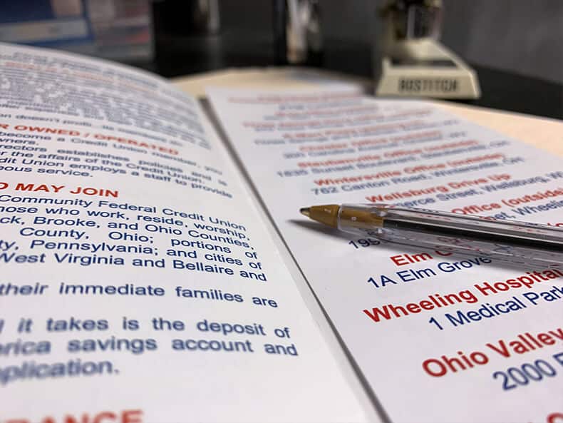
The current website had a lot of content. It wasn’t your typical paragraph and photos – it was tables and charts. We knew from the start that a major purpose of this website was to give their customers easy access to rates and prices. This was not going to change.
One thing we could do was make the content more structured and organized. As part of all my websites, I break out the sitemap.xml file and take a look at what the client had out there on the web. Something I found helpful was to copy the sitemap, open up a blank Excel document, paste in the sitemap, and sort the columns. It’s really easy to find the pages and delete everything else.
There were plenty of pages, but we were missing some major ones. If you want to show up on search engines for a topic, it’s wise to have a page dedicated to that topic. After a little keyword research, I put together a proposed site outline.
Outsource the Writing
Often I will do the research – for each topic – and do the writing. In this situation, my friend who gave me the referral offered to do the writing. I was happy to split the deal and focus on design and development.
I gave him some ground rules for our content. We were looking for several paragraphs per page. Any page with less than 250 words tends to be ignored. The content needed to be relevant to the user and also the search engine. We had a great chance to explain many of their services. If done correctly, it would be a win for the bots, for the users, and us.
After a few days, we had the content all jotted down in a Word document. We sent off to the client for approval. I would shift my focus on design.
Multiple Website Themes for the Multi-Location Business
I am going to skip around slightly here and tell this story in Tarantino fashion.
The developer is sitting at a desk. The brightness of his computer screen reflects on his glasses. He takes a long drink of his coffee, which is borderline cold. He reads his email.
To: Eric
From: Marketing Person 1
Subject: We think we want to try out another design.
Design Chapter 1
I was in the original meeting with my laptop. I closed my Word document and turned the computer around. For the last several months I was using a Genesis theme for a sandbox project. This theme would be perfect for a business.
They asked what a responsive website was and I wanted to demonstrate what a responsive website looked like. I showed them my sandbox website. It was a no brainer – ask them if this theme would work for them. They said, ‘yes, that would be great.’
I went back to the office and created the development site and installed the theme. I would have to make some major renovations, but I was familiar and this would work.
Design Chapter 2
The President of the company made references in the meeting of several websites he liked. There were a few in Pittsburgh that he kept going back to and indicating he liked their look. Just like FCAFCU, his favorite was a multi-location website. This is something I often ask and really put a heavy-weight on the answers for my designs.
Not only did I take a look at his suggestions, but I also took a look at many of the industry leaders. I wanted to look at how other financial institutions handled having multiple locations on their website. We needed a website that gave information about the credit union but also highlighted each office. The design I selected would be capable of all of these requirements.
Design Chapter 3
The design was finished. This felt like the perfect resolution. I mirrored the graphic tone of the president’s favorite industry site. I used the colors of the brand, created some special styles – unique for this site, and made all of the edits suggested. It was time to get feedback.
The very next email: let’s change out the graphics.
The life of a web designer was beginning to be tough. The client was doing everything right though. We are making changes before launching. If this was a hand-coded multi-location website, we would be way too far into the process to make these cosmetic changes. We have the flexibility with a WordPress theme.
Design Chapter 4
…coming soon.
Related items

Creepy, Historic Custom WordPress Website

Local Business Equipment Website
Helpful, Informational Website Design
