Graphic Design Training Camp
Early July of each year, the strongest, burliest men gather their belongings and head to hang out with the boys. Their time to rest and relax is over. It’s time to pump some iron, race up arena stairs, and smack each other in the face. Training camp has begun.
….and I lay in my bed, scrolling up and down on my mobile phone at 1 am.
I do have something in common with the football players of America. No, it’s not muscle. It’s probably not a competitive spirit. I know it’s not pure masculinity running through my veins.
It is getting in shape.
Looking for the Newest Graphic Design Trends
I’m well aware that the majority of my job is doing web design. A lot of my job deals with typing code and playing with numbers. Although I love working with graphics and illustrations, I don’t live in graphic design programs. Just like an off-season, you get rusty and out of shape. If I am not designing daily – I get fat and out of shape.
New graphic design trends pop-up every year. You start seeing television commercials, digital advertisements, and billboards all using similar styles. Sometimes it’s colors and other times its use of shapes. When a new trend emerges, brands attach. The trend becomes so prevalent in everyday life that it becomes the norm and loses the unique touch that had it mimicked in the first place. I’m guilty of such crimes.
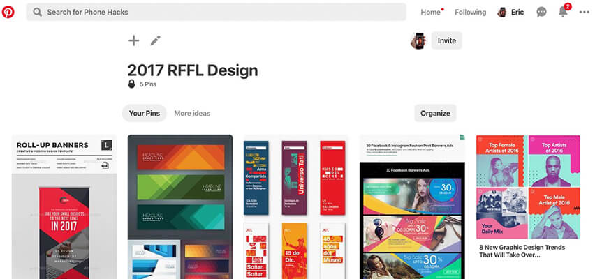
It’s not hard to find the newest trends. A simple Google or Pinterest search will give you tons of blogs indicating the top graphic design trends of (current year). I’m not one to recreate the wheel and I have never been one to say I am going to be the Graphic Design Trendsetter. I take a look at various blogs and articles and start creating.
Take It to the Practice Field
Although I have several clients that would allow me to use their brand to test out some of the latest styles, not every graphic design trend fits every brand. Neon colors might not be the best fit for a law firm. Thankfully I control a brand that allows for pretty much any variation.
I have been running a fantasy football league with my friend Justin Benline for 15 years and counting. At first, it was all his and he would just supply us the stats and run the league. A few years in, I felt we needed to make this a brand so we could recruit and keep the best. I made a webpage, created a Facebook page, and various other social networks. I handled the “marketing” and he was the facility manager.
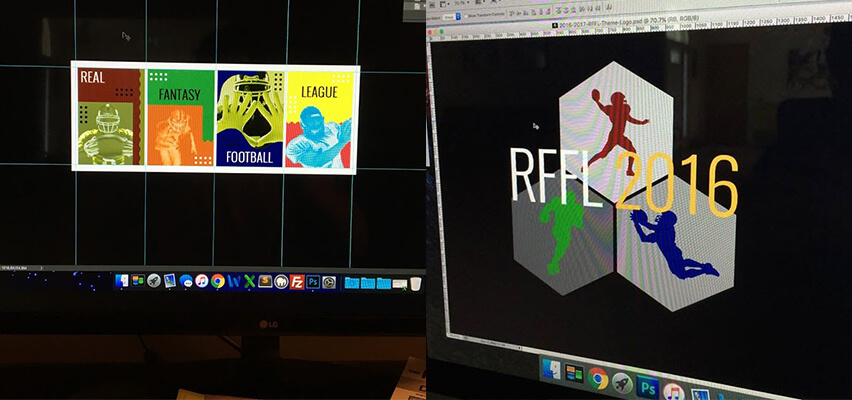
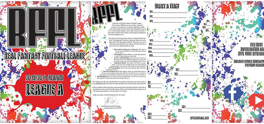
Even though it’s not necessary, I update the brand’s graphics for the year. As you can probably tell from reading, I use the fantasy league as a sandbox for the latest styles and trends. Some years I get real experimental and other years I have to whip up something quick.
Previous Graphic Design Trends
Designing for 2019
I always start with a simple Google search for “graphic design trends ‘year'”. This year was no different.
I check out some of the best articles. On this day, Adobe had the snippet and got my click. I wasn’t impressed by the article and bounced. The third result down “The 8 Biggest Graphic Design Trends That Will Dominate 2019” was intriguing. Besides the fact that my internet service hated the lazy-loading images, this was perfect to get some inspiration.
Without hi-jacking the article, I stopped on a few trends that I thought would work.
- Strong Typographic Focal Points
- Futuristic Influences
I loved the futuristic designs but knew I would have to put way more time in the actual creation. Since I had very little time this year to get the art produced, I think focusing on the typography would look great, be different, and also be quick.
All I needed was some good graphics.
Simple and Easy
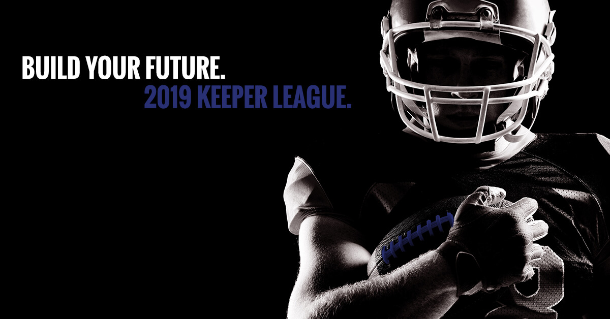
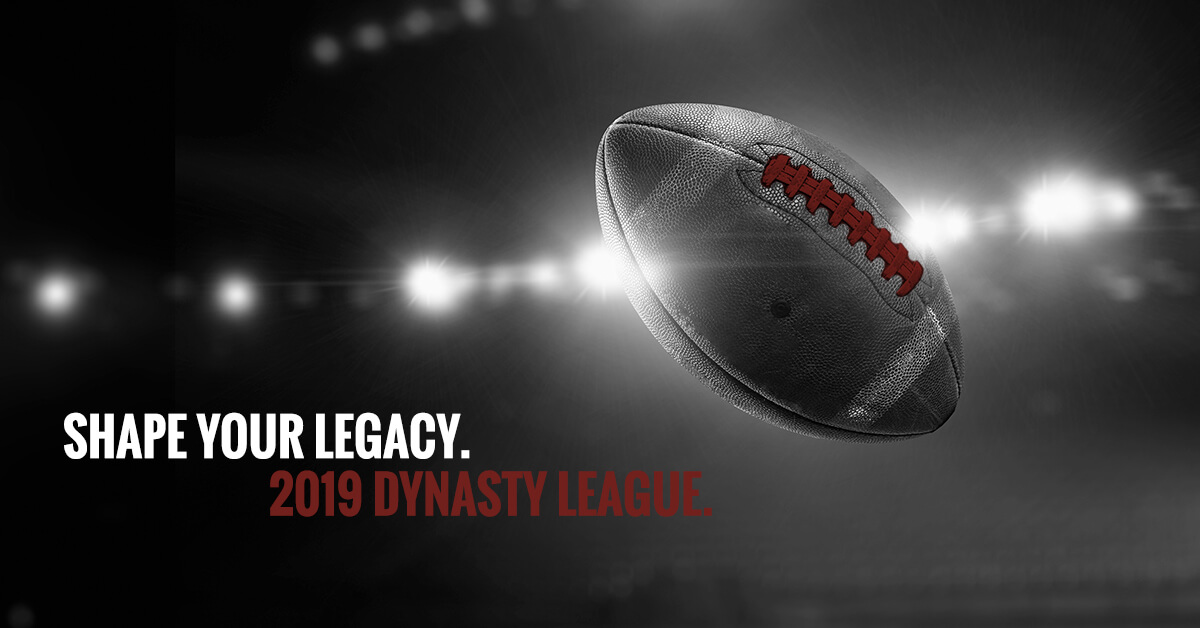
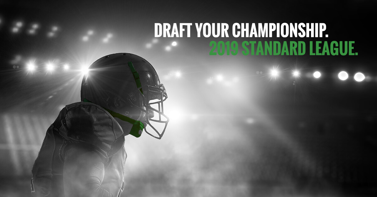
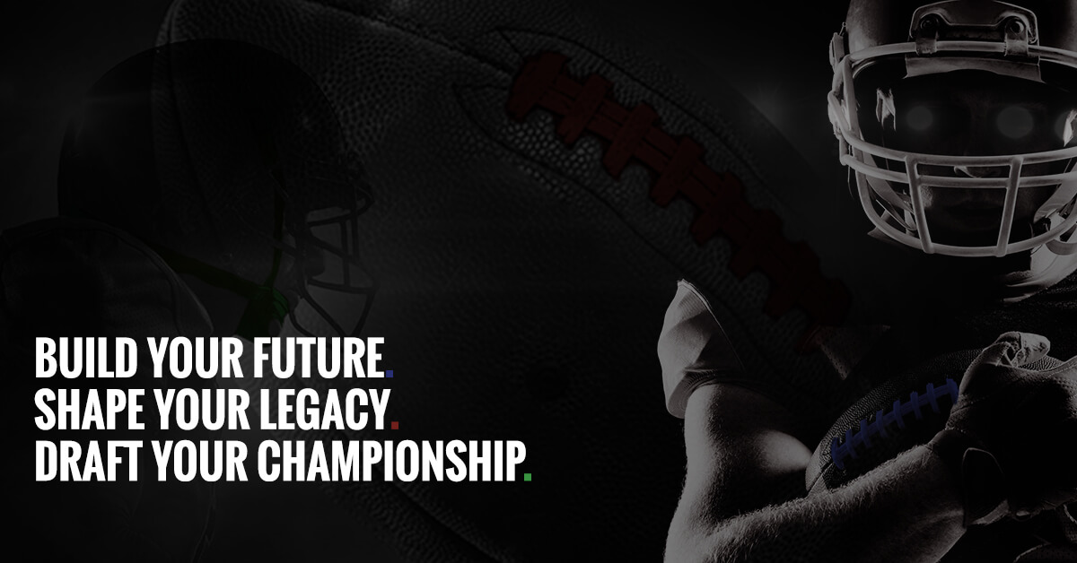
Lots of advertisements online and on television are using dark backgrounds, stock (like) photography, and their branding in white font. The article referenced above shows Samsumg using this technique. This seemed perfect. I’ve never created ‘quotes’ or ‘brand tags’ for my leagues. I had access to some high-quality photos and graphics. This was going to be an easy year.
I developed a style guide for the RFFL years ago. The two major fonts were Oswald and Josefin Sans. I played with both, lowercase, uppercase, bold, etc… Oswald in uppercase was the best fit.
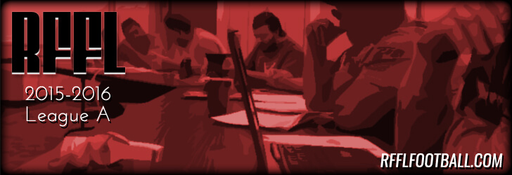
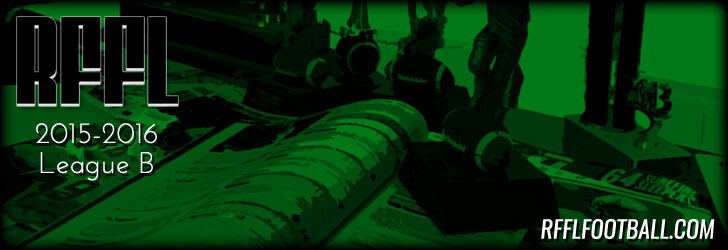
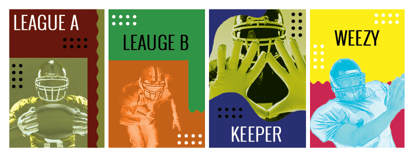
I had to create at least three graphics (one for each league). They all have distinctive brands.
- The Keeper League – you draft a new team every year but can keep a few players from the previous year.
- The Dynasty League – you draft one-time and keep all of your players year over year.
- The Standard League – you draft a new team every year.
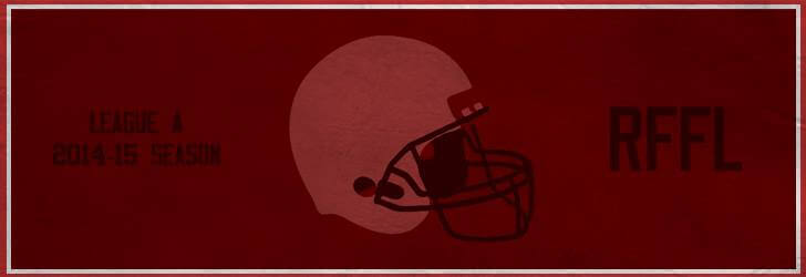
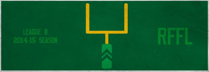
With these very basic breakdowns, I decided to create one single statement for each league. Each league also has a color that helps us easily identify which league website we are in. I would implement these colors (slightly) in the design. There was not going to be a lot of time and effort into these designs, but they will look great.
Final Product
Is this design pretty simple? Yes.
Do I think it looks good? Also yes.
Did I learn and test out some new graphic design styles? YES, that was the goal.
I’m sure there are a lot of graphic designers that fall into the trap of doing the same thing over and over. When you have a deadline, you need to get a good product out and move on to the next. You tend to become a master at a certain style or design. This probably isn’t the worst thing.
By trying and sampling different styles, you expand your playbook. When you need a flea-flicker (a very underutilized play in football), it won’t be such a problem because you ran that play before. Just like football, the game evolves and there are always new, creative ways to run an offense…I mean…design an ad.
You can always just do the search on the Internet and read about the latest trends. But just like any coach will tell you, putting in the actual time practicing will make you a champion. The team I practice with is Fantasy Football. Who are you scrimmaging?

